Vida Liveness
Vida Liveness
Vida Liveness is a selfie liveness detection component that guides users through a multi-step flow — instructions, camera capture, and preview verification — using the Vida SDK for biometric authentication.
Visual Specifications
Section titled “Visual Specifications”Page Header
Section titled “Page Header”| Property | Value |
|---|---|
| Background | #FFFFFF (tselWhite) |
| Padding | 16px vertical, 20px horizontal (40px @1280px+) |
| Gap | 20px |
| Shadow | 0px 4px 14px 0px #0000000F |
| Back Button Size | 24×24px |
| Title Font | 20px bold (16px @1280px+), #001A5C (darkBlue) |
| Title Max Width | 464px (@1280px+) |
| Spacer Width | 24px |
Content Area
Section titled “Content Area”| Property | Value |
|---|---|
| Background | #F8FAFC (container), #FFFFFF (content card) |
| Padding | 20px |
| Gap | 12px |
| Border Radius | 10px (top corners) |
| Max Width | 600px (@768px+) |
| Height | 100dvh |
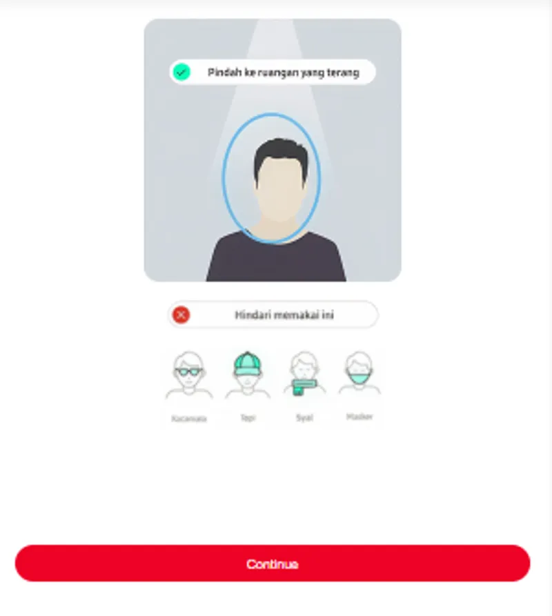
Instruction Visuals
Section titled “Instruction Visuals”| Element | Width |
|---|---|
| Main Instruction Image | 280px |
| Warning Image | 231px |
| No Accessories Image | 242px |
Info Banner & Error
Section titled “Info Banner & Error”| Property | Info Banner | Info Error |
|---|---|---|
| Background | #EEEFF1 | #FFE6E9 |
| Text Color | #000C1F | #D32F2F |
| Font Size | 14px | 14px |
| Line Height | 20px | 20px |
| Padding | 12px horizontal, 8px vertical | 12px horizontal, 8px vertical |
| Border Radius | 8px | 8px |
Preview Frame
Section titled “Preview Frame”| Property | Value |
|---|---|
| Aspect Ratio | 3:4 |
| Max Height | 400px |
| Border Radius | 16px |
| Image Fit | object-cover |
Footer
Section titled “Footer”| Property | Value |
|---|---|
| Background | #FFFFFF |
| Padding | 20px horizontal, 8px top, 20px + safe-area bottom |
| Max Width | 600px (@768px+) |
Buttons
Section titled “Buttons”| Property | Primary Button | Outline Button |
|---|---|---|
| Background | #D6001C | transparent |
| Text Color | #FFFFFF | #D6001C |
| Border | none | 2px solid #FF0025 |
| Border Radius | 80px mobile / 56px desktop | 80px mobile / 56px desktop |
| Height | 45px mobile / 40px desktop | 45px mobile / 40px desktop |
| Font | 14px bold | 14px bold |
| Disabled Style | #E0E0E0 bg, cadetBlue text | — |
Spinner
Section titled “Spinner”| Property | Value |
|---|---|
| Size | 16×16px |
| Border Width | 2px |
| Animation | spin 0.6s linear infinite |
Camera View
Section titled “Camera View”| Property | Value |
|---|---|
| Background | #000000 (tselBlack) |
| Max Width | 600px (@768px+) |
| Height | 90svh |
| Video Border Radius | 16px mobile / 8px desktop |
| Video Max (desktop) | 504×374px |
Flow States
Section titled “Flow States”Instruction visuals shown with a continue button. Button disabled until token is available.
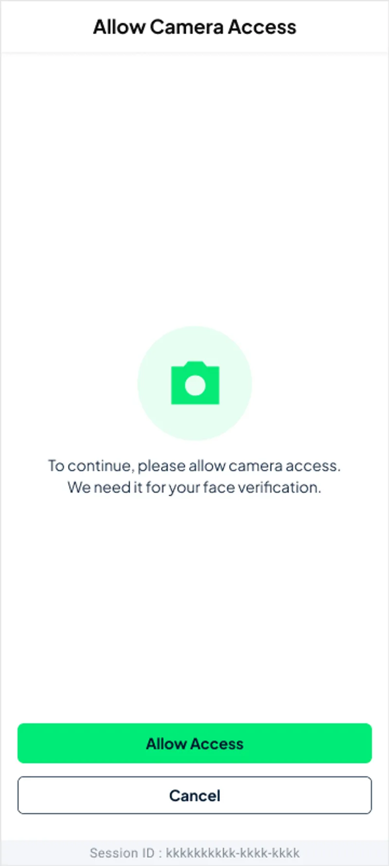
Active camera capture via Vida SDK rendered into #sdk-container.
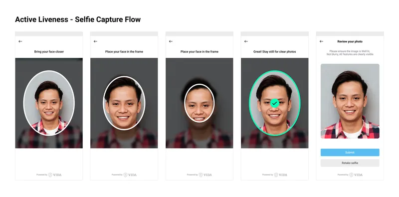
Captured selfie shown in preview frame with verify and retake actions.
Configuration Options
Section titled “Configuration Options”| Option | Type | Default | Description |
|---|---|---|---|
configHeader.backButton | boolean | false | Show back button in header |
configHeader.title | string | '' | Header title text |
token | string | null | Vida SDK authentication token |
step | ’instructions’ | ‘camera’ | ‘preview’ | 'instructions' | Current flow step |
selfiePreview | string | null | Captured selfie image data URL |
errorMessage | string | null | Validation or capture error message |
isVerifying | boolean | false | Shows spinner during verification |
Behavior Patterns
Section titled “Behavior Patterns”| Behavior | Description |
|---|---|
| Step Flow | Instructions → Camera → Preview |
| Token Gate | Continue button disabled when token missing |
| Camera Init | SDK loads into #sdk-container on camera step |
| Capture Result | Selfie stored in selfiePreview, advances to preview |
| Verify Action | Triggers verification with loading spinner |
| Retake Action | Returns to camera step for new capture |
| Error Display | errorMessage shown below preview frame |
| Back Navigation | Optional back button calls handleBack() |
Responsive Behavior
Section titled “Responsive Behavior”| Screen | Layout |
|---|---|
| Desktop | Centered content, max-width 480px |
| Tablet | Full-width with padding |
| Mobile | Full-width, camera fills viewport |
Usage Guidance
Section titled “Usage Guidance”When to use
Section titled “When to use”- Identity verification flows
- KYC (Know Your Customer) processes
- Biometric authentication
- Account recovery with liveness check
- Fraud prevention in onboarding
Best practices
Section titled “Best practices”| ✅ Do | ❌ Don’t |
|---|---|
| Provide clear instruction visuals | Launch camera without guidance |
| Disable continue until token ready | Allow capture without valid token |
| Show loading state during verify | Leave verify button without feedback |
| Offer retake option | Force single capture attempt |
| Display specific error messages | Show generic or unclear errors |
| Handle camera permission denial | Assume camera always available |
| Support multiple languages | Hardcode instruction text |
Accessibility
Section titled “Accessibility”- Camera permission prompts announced to screen readers
- Keyboard-navigable buttons with visible focus indicators
- Descriptive alt text for instruction and preview images
- Error messages associated with relevant UI regions
- Loading state communicated via aria-live for spinner
- Back button uses
type="button"to prevent form submission
Integration Requirements
Section titled “Integration Requirements”| Requirement | Description |
|---|---|
| Vida SDK | Loaded into #sdk-container div |
| Auth Token | Required before enabling capture |
| Translate Pipe | i18n keys under vidaLiveness.selfieCapture.* |
| Assets | Instruction images in assets/images/swafoto-instruction-*.png |
| Icons | Back arrow in assets/icons/arrow-left-tail.svg |