Carousel Banner
Carousel Banner
Carousel Banner displays promotional banners in an auto-playing carousel with dots navigation and responsive configuration.
Visual Specifications
Section titled “Visual Specifications”| Property | Value |
|---|---|
| Container Max-Width | 1440px |
| Aspect Ratio | 16:9 |
| Image Border-Radius | 20px 20px 20px 0 |
| Loading Animation | Shimmer effect (1.5s) |
| Desktop Padding | 3rem (48px) horizontal |
Component Composition
Section titled “Component Composition”Carousel Banner is a wrapper component that utilizes app-basic-carousel.
CSS Customization (via CSS Variables)
Section titled “CSS Customization (via CSS Variables)”These variables must be applied to app-basic-carousel:
| Variable | Value |
|---|---|
--carousel-horizontal-padding | 0 |
--carousel-dots-align | flex-start |
Responsive Navigation Positioning
Section titled “Responsive Navigation Positioning”| Breakpoint | Prev Left | Next Right |
|---|---|---|
| Mobile | -65px | -65px |
| Tablet (768px+) | 7px | 7px |
| Desktop (1280px+) | -42px | -42px |
Configuration Options
Section titled “Configuration Options”| Option | Type | Description |
|---|---|---|
config | OwlOptions | Carousel settings |
banners | CarouselBannerData[] | Banner data array |
Loading State
Section titled “Loading State”The component utilizes a loading state with a shimmer animation (1.5s infinite) applied to banner images during the fetch cycle, ensuring a smooth transition from loading to display.
Display Modes
Section titled “Display Modes”Single static banner display (carousel disabled).

Multiple banners with dot pagination and auto-play.
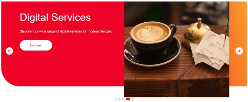
Clickable banners directing users to product or category detail pages.
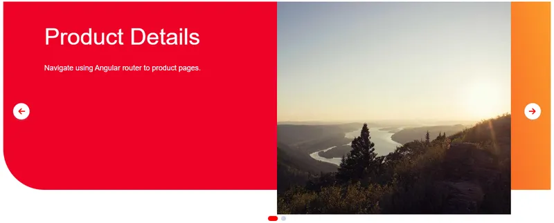
Usage Guidance
Section titled “Usage Guidance”When to use
Section titled “When to use”- Homepage hero banners
- Promotional content
- Featured products
- Marketing campaigns
Best practices
Section titled “Best practices”| ✅ Do | ❌ Don’t |
|---|---|
| Optimize image sizes | Large file loads |
| Provide alt text | Poor accessibility |
| Test autoplay behavior | Too fast/slow |
| Link to relevant content | Broken/dead links |
| Use consistent aspect ratio | Janky transitions |