Custom Paginator
Custom Paginator
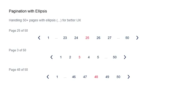
Custom Paginator displays page numbers with navigation arrows and ellipsis for large page counts.
Visual Specifications
Section titled “Visual Specifications”| Property | Value |
|---|---|
| Arrow Size | 24×24px |
| Page Number Font | font-poppins-regular, 14px (mobile), 16px (desktop) |
| Active Page Color | text-primary-tselRed |
| Default Text Color | text-primary-darkBlue |
| Ellipsis Style | span.ellipsis |
| Gap | 16px (gap-4) |
Variants
Section titled “Variants”Displays standard page numbers 1-N. Active page highlighted with red.

Includes … for truncated page ranges when total pages exceed display threshold.
Configuration Options
Section titled “Configuration Options”| Option | Type | Description |
|---|---|---|
pages | array | Array of page numbers or ... ellipsis |
currentPage | number | Currently selected page index |
chevronClick(dir) | method | Handles left/right arrow navigation |
goToPage(page) | method | Navigates to selected page |
stateColorArrowPage(dir) | method | Dynamically returns arrow fill color |
Component Logic
Section titled “Component Logic”| Feature | Description |
|---|---|
| Arrows | Dynamic viewBox: Left (24x24), Right (16x16) |
| Ellipsis | Rendered as <span>...</span> when page === '...' |
| Active State | currentPage === page triggers text-primary-tselRed |
| Color Logic | Arrows fill calculated by stateColorArrowPage(dir) |
Usage Guidance
Section titled “Usage Guidance”When to use
Section titled “When to use”- Data tables
- Search results
- Product listings
- Article feeds
Best practices
Section titled “Best practices”| ✅ Do | ❌ Don’t |
|---|---|
| Show current position | Lost in pagination |
| Reasonable page counts | Too many pages |
| Direct page access | Next/prev only |
| Maintain state | Lost page on reload |