Autocomplete
Autocomplete
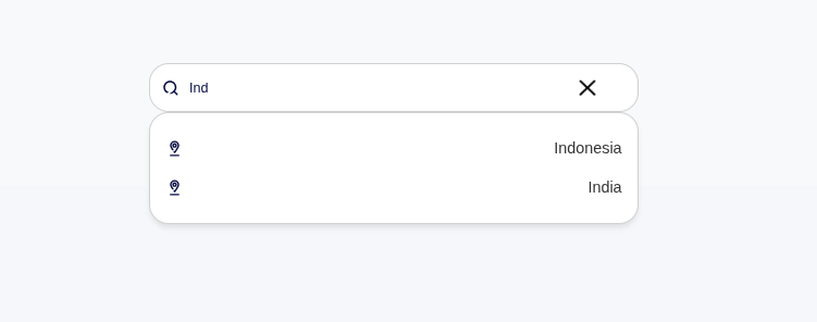
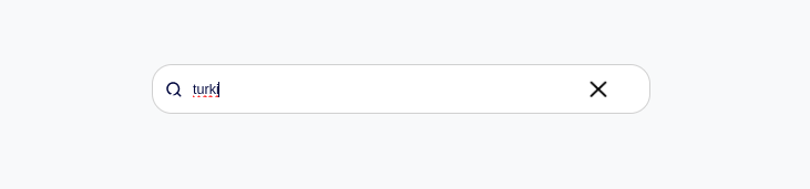
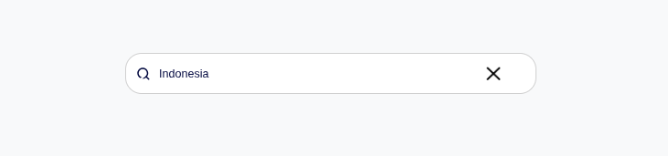
Autocomplete provides an intelligent input field with predictive suggestions, keyboard navigation, and search with a short wait before searching.
Visual Specifications
Section titled “Visual Specifications”| Property | Value |
|---|---|
| Input Height | 48px |
| Border Radius | 20px |
| Panel Max-height | 300px |
| Item Height | 36px |
| Search Delay | 1000ms (configurable) |
| Font Size | 14px |
| Font Family | Poppins |
States
Section titled “States”Initial state with placeholder text visible.

Input field focused, cursor visible, ready for typing.
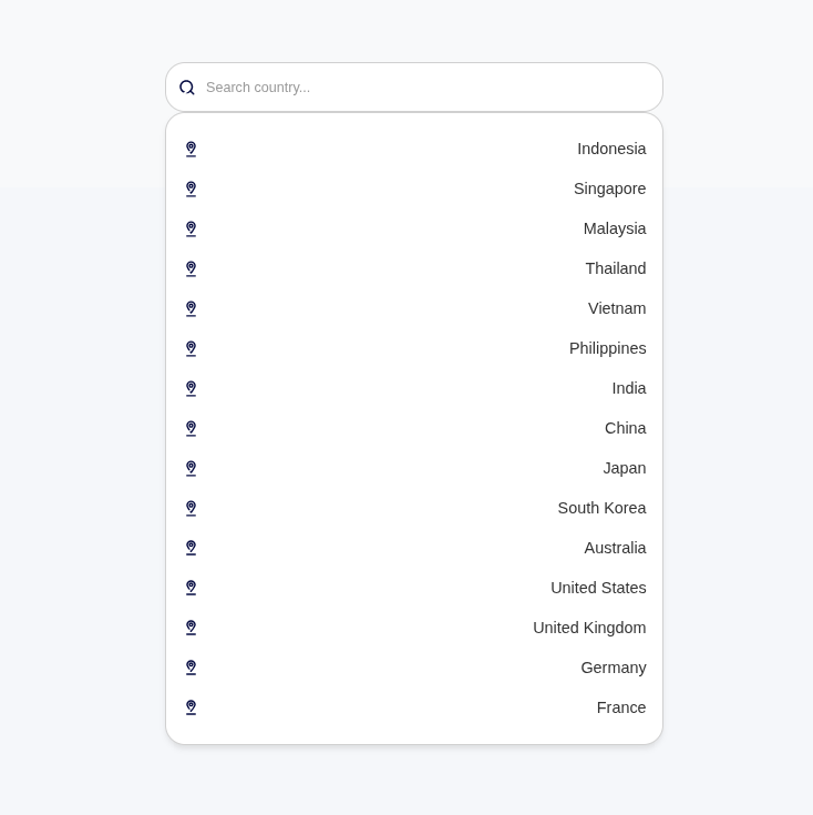
Dropdown panel open with matched options displayed.
When no matching options found, the dropdown closes automatically.
Option selected, value displayed with clear button visible.
Keyboard Navigation
Section titled “Keyboard Navigation”| Key | Action |
|---|---|
| ↓ Arrow | Navigate down suggestions |
| ↑ Arrow | Navigate up suggestions |
| Enter | Select highlighted option or close panel |
| Escape | Close suggestions panel |
| Tab | Select on blur |
Display Format
Section titled “Display Format”| Format | Description | Example |
|---|---|---|
| Single Field | Show single property | ”John Doe” |
| Multiple Fields | Show combined fields | ”John Doe - john@example.com” |
| With Highlight | Bold matching text | ”John Doe” |
Behavior Variants
Section titled “Behavior Variants”| Variant | Behavior |
|---|---|
| Select Only | Must choose from suggestions |
| Free Text | Allow custom values |
| Multi-select | Select multiple items |
Usage Guidance
Section titled “Usage Guidance”When to use
Section titled “When to use”- Searching from large datasets
- Predictive text input
- Tag/category selection
- User lookups
- Product/item selection
Best practices
Section titled “Best practices”| ✅ Do | ❌ Don’t |
|---|---|
| Wait before searching | Fire on every keystroke |
| Handle no results | Show empty panel |
| Allow keyboard navigation | Mouse-only interaction |
| Clear selection option | No way to reset value |
Message Examples
Section titled “Message Examples”| Scenario | Message |
|---|---|
| No results | (Dropdown closes, no message) |
| Min chars | Trigger immediately on type |