FAQ
FAQ
FAQ displays frequently asked questions in tabbed categories with accordion-style expandable answers and show more functionality.
Visual Specifications
Section titled “Visual Specifications”| Property | Value |
|---|---|
| Container Max-Width | 1440px |
| Heading Line | 99x4px (mobile) / 186x6px (desktop) |
| Tab Header | mat-tab-group with custom ink bar (red) |
| Item Spacing | 20x15px (mobile) / 40x70px (desktop) |
| Accordion Animation | accr-rotate (180deg) |
Layout States
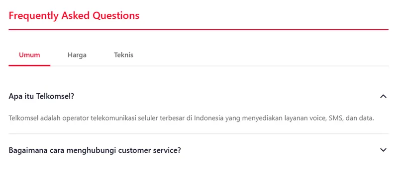
Section titled “Layout States”Horizontal scrollable tab categories.
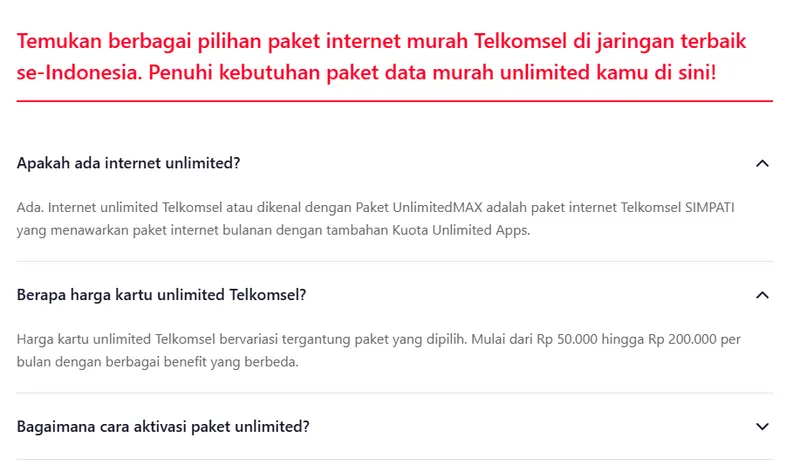
Expanded accordion answer with rotated icon.
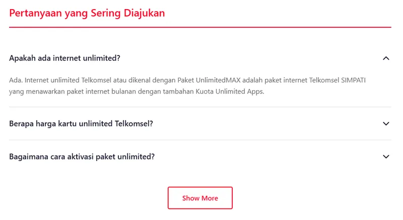
Show more button interaction for partial lists.
Component Behavior
Section titled “Component Behavior”| Interaction | Logic |
|---|---|
tabChanged() | Triggers tab selection and view update |
openAccordion() | Toggles guide.isOpen and icon rotation classes |
see-more-scroll | Bouncing animation indicator for mobile overflow |
wrapper-show-more | Displays btn-primary-submit if tab.showMore is true |
Accessibility & Tabs
Section titled “Accessibility & Tabs”- Tabs: Uses
mat-tab-group. Pagination is disabled via CSS; scroll is handled via overflow. - Accordion: Accessible via
(click)events on the accordion title row, toggling content expansion.
Content Types
Section titled “Content Types”| Type | Format | Example |
|---|---|---|
| Paragraph | <p> | Plain text answer |
| List | <ul>, <ol> | Bullet/numbered list |
| Mixed | Combined | Text with lists |
Usage Guidance
Section titled “Usage Guidance”When to use
Section titled “When to use”- Help center pages
- Product support
- Onboarding documentation
- Policy explanations
Best practices
Section titled “Best practices”| ✅ Do | ❌ Don’t |
|---|---|
| Group by category | One giant list |
| Clear questions | Vague phrasing |
| Concise answers | Walls of text |
| Searchable content | Hard to find info |
| Mobile-friendly | Cramped display |